Create JS Radial Gradient with Matrix in HTML
Creating a radial gradient with a matrix in HTML using JavaScript can be an interesting way to add visually appealing effects to your web pages. In this article, we will explore how to create radial gradients and manipulate them using transformation matrices. We will cover the basics of creating a radial gradient, applying a matrix transformation, and then provide several examples of how to use these techniques in your HTML pages.
Understanding Radial Gradients
A radial gradient is defined by its center, the radius of the inner and outer circles, and the color stops that determine how the colors are distributed within the gradient. In CSS, a radial gradient can be created using the radial-gradient()
function. However, in this article, we will focus on creating radial gradients using the HTML5 canvas element and JavaScript.
The Canvas Element
The <canvas>
element is used to draw graphics on a web page using JavaScript. It provides a drawing context where we can use various methods to create shapes, patterns, and gradients.
Creating a Basic Radial Gradient
To create a radial gradient in a canvas, we use the createRadialGradient()
method of the canvas rendering context. This method requires six parameters: the x and y coordinates of the start circle, its radius, the x and y coordinates of the end circle, and its radius.
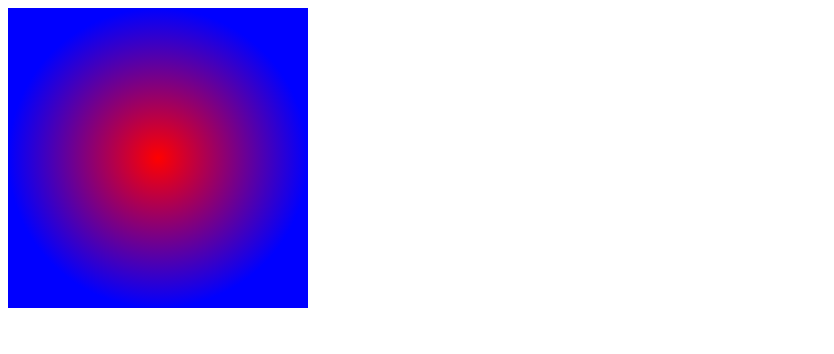
Example 1: Basic Radial Gradient
<!DOCTYPE html>
<html lang="en">
<head>
<meta charset="UTF-8">
<title>Radial Gradient Example</title>
<script>
window.onload = function() {
var canvas = document.getElementById('myCanvas');
var ctx = canvas.getContext('2d');
var gradient = ctx.createRadialGradient(150, 150, 0, 150, 150, 150);
gradient.addColorStop(0, 'red');
gradient.addColorStop(1, 'blue');
ctx.fillStyle = gradient;
ctx.fillRect(0, 0, 300, 300);
};
</script>
</head>
<body>
<canvas id="myCanvas" width="300" height="300"></canvas>
</body>
</html>
Output:
Transforming Gradients with Matrices
Transformation matrices allow us to scale, rotate, translate, and skew the gradients we create. In canvas, we can use the setTransform()
method to apply a transformation matrix directly.
Example 2: Scaling a Radial Gradient
<!DOCTYPE html>
<html lang="en">
<head>
<meta charset="UTF-8">
<title>Scale Radial Gradient Example</title>
<script>
window.onload = function() {
var canvas = document.getElementById('myCanvas');
var ctx = canvas.getContext('2d');
var gradient = ctx.createRadialGradient(150, 150, 0, 150, 150, 150);
gradient.addColorStop(0, 'green');
gradient.addColorStop(1, 'yellow');
ctx.setTransform(2, 0, 0, 2, 0, 0); // Scale by 2x
ctx.fillStyle = gradient;
ctx.fillRect(0, 0, 150, 150);
};
</script>
</head>
<body>
<canvas id="myCanvas" width="300" height="300"></canvas>
</body>
</html>
Output:
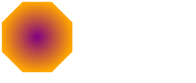
Example 3: Rotating a Radial Gradient
<!DOCTYPE html>
<html lang="en">
<head>
<meta charset="UTF-8">
<title>Rotate Radial Gradient Example</title>
<script>
window.onload = function() {
var canvas = document.getElementById('myCanvas');
var ctx = canvas.getContext('2d');
var gradient = ctx.createRadialGradient(150, 150, 0, 150, 150, 150);
gradient.addColorStop(0, 'purple');
gradient.addColorStop(1, 'orange');
ctx.setTransform(1, 0, 0, 1, 0, 0); // Reset transform
ctx.translate(150, 150); // Move to center
ctx.rotate(Math.PI / 4); // Rotate 45 degrees
ctx.translate(-150, -150); // Move back
ctx.fillStyle = gradient;
ctx.fillRect(0, 0, 300, 300);
};
</script>
</head>
<body>
<canvas id="myCanvas" width="300" height="300"></canvas>
</body>
</html>
Output:
Example 4: Translating a Radial Gradient
<!DOCTYPE html>
<html lang="en">
<head>
<meta charset="UTF-8">
<title>Translate Radial Gradient Example</title>
<script>
window.onload = function() {
var canvas = document.getElementById('myCanvas');
var ctx = canvas.getContext('2d');
var gradient = ctx.createRadialGradient(75, 75, 0, 75, 75, 75);
gradient.addColorStop(0, 'pink');
gradient.addColorStop(1, 'black');
ctx.setTransform(1, 0, 0, 1, 100, 100); // Translate 100px right and down
ctx.fillStyle = gradient;
ctx.fillRect(0, 0, 150, 150);
};
</script>
</head>
<body>
<canvas id="myCanvas" width="300" height="300"></canvas>
</body>
</html>
Output:
Example 5: Skewing a Radial Gradient
<!DOCTYPE html>
<html lang="en">
<head>
<meta charset="UTF-8">
<title>Skew Radial Gradient Example</title>
<script>
window.onload = function() {
var canvas = document.getElementById('myCanvas');
var ctx = canvas.getContext('2d');
var gradient = ctx.createRadialGradient(150, 150, 0, 150, 150, 150);
gradient.addColorStop(0, 'lightblue');
gradient.addColorStop(1, 'darkblue');
ctx.setTransform(1, 0.5, 0.5, 1, 0, 0); // Skew the gradient
ctx.fillStyle = gradient;
ctx.fillRect(0, 0, 300, 300);
};
</script>
</head>
<body>
<canvas id="myCanvas" width="300" height="300"></canvas>
</body>
</html>
Output:
Combining Transformations
We can combine multiple transformations to achieve more complex effects. The order of transformations is important, as they are applied in sequence.
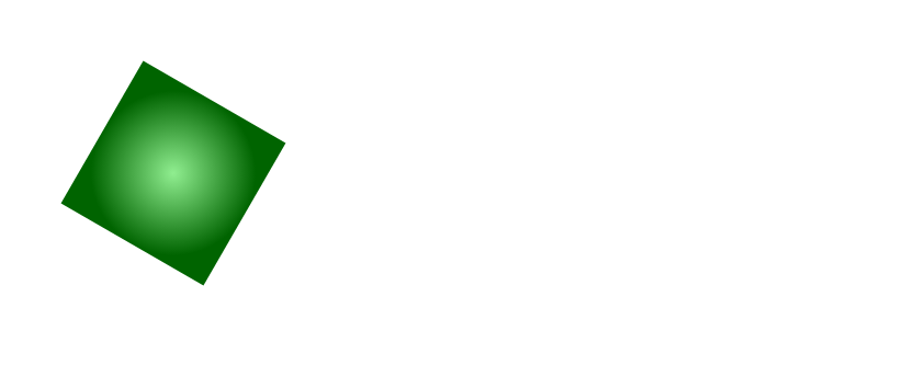
Example 6: Scale and Rotate Combined
<!DOCTYPE html>
<html lang="en">
<head>
<meta charset="UTF-8">
<title>Scale and Rotate Combined Example</title>
<script>
window.onload = function() {
var canvas = document.getElementById('myCanvas');
var ctx = canvas.getContext('2d');
var gradient = ctx.createRadialGradient(150, 150, 0, 150, 150, 150);
gradient.addColorStop(0, 'lightgreen');
gradient.addColorStop(1, 'darkgreen');
ctx.setTransform(1, 0, 0, 1, 0, 0); // Reset transform
ctx.translate(150, 150); // Move to center
ctx.scale(0.5, 0.5); // Scale down
ctx.rotate(Math.PI / 6); // Rotate
ctx.translate(-150, -150); // Move back
ctx.fillStyle = gradient;
ctx.fillRect(0, 0, 300, 300);
};
</script>
</head>
<body>
<canvas id="myCanvas" width="300" height="300"></canvas>
</body>
</html>
Output:
Example 7: Translate and Skew Combined
<!DOCTYPE html>
<html lang="en">
<head>
<meta charset="UTF-8">
<title>Translate and Skew Combined Example</title>
<script>
window.onload = function() {
var canvas = document.getElementById('myCanvas');
var ctx = canvas.getContext('2d');
var gradient = ctx.createRadialGradient(75, 75, 0, 75, 75, 75);
gradient.addColorStop(0, 'lightgray');
gradient.addColorStop(1, 'darkgray');
ctx.setTransform(1, 0, 0, 1, 0, 0); // Reset transform
ctx.translate(100, 100); // Move right and down
ctx.transform(1, 0.5, 0.5, 1, 0, 0); // Skew
ctx.fillStyle = gradient;
ctx.fillRect(0, 0, 150, 150);
};
</script>
</head>
<body>
<canvas id="myCanvas" width="300" height="300"></canvas>
</body>
</html>
Output:
Conclusion
Creating radial gradients and transforming them with matrices in HTML using JavaScript can add a unique touch to your web pages. The examples provided in this article should give you a good starting point to experiment with these techniques. Remember that the order of transformations is important and that you can combine multiple transformations to achieve more complex effects. Happy coding!
For more information and tutorials, visit how2html.com.