Center One and Right/Left Align Other Flexbox Element in HTML
Flexbox is a powerful layout tool in CSS that allows for the efficient arrangement of elements within a container, even when their size is unknown or dynamic. In this article, we will explore how to use Flexbox to center one element and right or left align another element within the same container. This is a common design pattern for headers, footers, and various sections of a webpage where you might want to highlight one element while keeping others accessible.
Understanding Flexbox
Before we dive into the examples, let’s briefly review some key concepts of Flexbox that will be used throughout this article:
- Flex Container: The parent element that has
display: flex;
applied to it. It defines a flex context for all its children. - Flex Item: The children of a flex container.
- Main Axis: The primary axis along which flex items are laid out. By default, it is horizontal (row), but it can be changed to vertical (column) with flex-direction.
- Cross Axis: The axis perpendicular to the main axis.
- Justify Content: This property aligns flex items along the main axis.
- Align Items: This property aligns flex items along the cross axis.
Example 1: Basic Flexbox Centering
Let’s start with a simple example where we center one element and align another to the right within a flex container.
<!DOCTYPE html>
<html lang="en">
<head>
<meta charset="UTF-8">
<meta name="viewport" content="width=device-width, initial-scale=1.0">
<title>Flexbox Example - how2html.com</title>
<style>
.flex-container {
display: flex;
justify-content: space-between;
}
.center-item {
text-align: center;
flex-grow: 1;
}
.right-item {
text-align: right;
}
</style>
</head>
<body>
<div class="flex-container">
<div class="center-item">Centered Content - how2html.com</div>
<div class="right-item">Right Aligned Content - how2html.com</div>
</div>
</body>
</html>
Output:
Example 2: Centering with Spacer Elements
Sometimes, you might want to use invisible spacer elements to push content to the center and right.
<!DOCTYPE html>
<html lang="en">
<head>
<meta charset="UTF-8">
<meta name="viewport" content="width=device-width, initial-scale=1.0">
<title>Flexbox Spacer Example - how2html.com</title>
<style>
.flex-container {
display: flex;
}
.spacer {
flex: 1;
}
.center-item {
text-align: center;
}
.right-item {
text-align: right;
}
</style>
</head>
<body>
<div class="flex-container">
<div class="spacer"></div>
<div class="center-item">Centered Content - how2html.com</div>
<div class="spacer"></div>
<div class="right-item">Right Aligned Content - how2html.com</div>
</div>
</body>
</html>
Output:
Example 3: Center and Left Align with Flexbox
To align one element to the left and another to the center, we can adjust the justify-content
property.
<!DOCTYPE html>
<html lang="en">
<head>
<meta charset="UTF-8">
<meta name="viewport" content="width=device-width, initial-scale=1.0">
<title>Flexbox Left Align Example - how2html.com</title>
<style>
.flex-container {
display: flex;
justify-content: space-between;
}
.left-item {
text-align: left;
}
.center-item {
text-align: center;
flex-grow: 1;
}
</style>
</head>
<body>
<div class="flex-container">
<div class="left-item">Left Aligned Content - how2html.com</div>
<div class="center-item">Centered Content - how2html.com</div>
</div>
</body>
</html>
Output:
Example 4: Using Margin Auto for Centering
Margin auto is another technique to center flex items. It automatically distributes space around the item.
<!DOCTYPE html>
<html lang="en">
<head>
<meta charset="UTF-8">
<meta name="viewport" content="width=device-width, initial-scale=1.0">
<title>Flexbox Margin Auto Example - how2html.com</title>
<style>
.flex-container {
display: flex;
}
.center-item {
margin: auto;
}
</style>
</head>
<body>
<div class="flex-container">
<div class="center-item">Centered Content with Margin Auto - how2html.com</div>
</div>
</body>
</html>
Output:
Example 5: Right Align with Absolute Positioning
In some cases, you might want to use absolute positioning to right align an element within a flex container.
<!DOCTYPE html>
<html lang="en">
<head>
<meta charset="UTF-8">
<meta name="viewport" content="width=device-width, initial-scale=1.0">
<title>Flexbox Absolute Position Example - how2html.com</title>
<style>
.flex-container {
display: flex;
position: relative;
}
.right-item {
position: absolute;
right: 0;
}
</style>
</head>
<body>
<div class="flex-container">
<div class="right-item">Right Aligned with Absolute Position - how2html.com</div>
</div>
</body>
</html>
Output:
Example 6: Center and Right Align with Flexbox and Order
Flexbox allows you to change the visual order of elements using the order
property.
<!DOCTYPE html>
<html lang="en">
<head>
<meta charset="UTF-8">
<meta name="viewport" content="width=device-width, initial-scale=1.0">
<title>Flexbox Order Example - how2html.com</title>
<style>
.flex-container {
display: flex;
}
.center-item {
flex-grow: 1;
text-align: center;
order: 2;
}
.right-item {
order: 3;
}
</style>
</head>
<body>
<div class="flex-container">
<div class="center-item">Centered Content with Order - how2html.com</div>
<div class="right-item">Right Aligned Content with Order - how2html.com</div>
</div>
</body>
</html>
Output:
Example 7: Responsive Flexbox Layout
Flexbox is great for creating responsive layouts. Here’s an example where the alignment changes based on screen size.
<!DOCTYPE html>
<html lang="en">
<head>
<meta charset="UTF-8">
<meta name="viewport" content="width=device-width, initial-scale=1.0">
<title>Responsive Flexbox Example - how2html.com</title>
<style>
.flex-container {
display: flex;
flex-wrap: wrap;
}
.center-item {
flex-basis: 100%;
text-align: center;
}
.right-item {
text-align: right;
flex-basis: 100%;
}
@media (min-width: 600px) {
.center-item, .right-item {
flex-basis: auto;
}
.flex-container {
justify-content: space-between;
}
}
</style>
</head>
<body>
<div class="flex-container">
<div class="center-item">Centered Content on Mobile - how2html.com</div>
<div class="right-item">Right Aligned Content on Desktop - how2html.com</div>
</div>
</body>
</html>
Output:
Example 8: Flexbox with Multiple Rows
Flexbox can also handle multiple rows of items. Here’s how you can align items in a multi-row layout.
<!DOCTYPE html>
<html lang="en">
<head>
<meta charset="UTF-8">
<meta name="viewport" content="width=device-width, initial-scale=1.0">
<title>Multi-Row Flexbox Example - how2html.com</title>
<style>
.flex-container {
display: flex;
flex-wrap: wrap;
}
.item {
width: 50%; /* Adjust this for more items per row */
text-align: center;
padding: 10px;
}
</style>
</head>
<body>
<div class="flex-container">
<div class="item">Item 1 - how2html.com</div>
<div class="item">Item 2 - how2html.com</div>
<div class="item">Item 3 - how2html.com</div>
<div class="item">Item 4 - how2html.com</div>
</div>
</body>
</html>
Output:
Example 9: Flexbox for Vertical Centering
Vertical centering is another common use case for Flexbox. Here’s how you can center items vertically within a container.
<!DOCTYPE html>
<html lang="en">
<head>
<meta charset="UTF-8">
<meta name="viewport" content="width=device-width, initial-scale=1.0">
<title>Vertical Centering Flexbox Example - how2html.com</title>
<style>
.flex-container {
display: flex;
height: 200px; /* Adjust height as needed */
align-items: center; /* This centers items vertically */
}
.item {
margin: auto; /* Centers horizontally */
}
</style>
</head>
<body>
<div class="flex-container">
<div class="item">Vertically Centered Item - how2html.com</div>
</div>
</body>
</html>
Output:
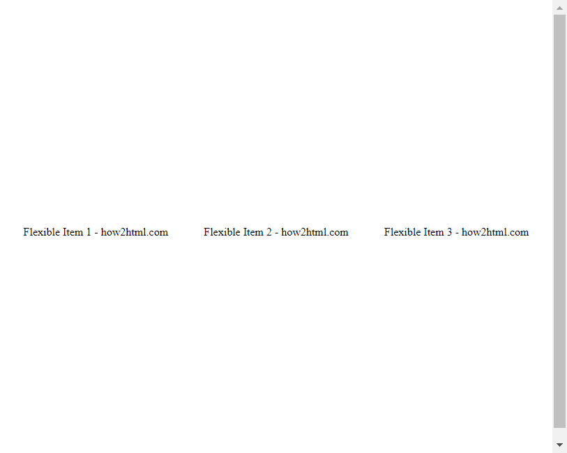
Example 10: Complex Flexbox Alignment
Combining multiple alignment techniques can solve complex layout challenges. Here’s an example of using justify-content
, align-items
, and flex-grow
together.
<!DOCTYPE html>
<html lang="en">
<head>
<meta charset="UTF-8">
<meta name="viewport" content="width=device-width, initial-scale=1.0">
<title>Complex Flexbox Alignment Example - how2html.com</title>
<style>
.flex-container {
display: flex;
justify-content: space-between; /* Aligns items on the main axis */
align-items: center; /* Aligns items on the cross axis */
height: 100vh; /* Full viewport height */
}
.item {
flex-grow: 1; /* Allows item to grow and fill space */
text-align: center;
}
</style>
</head>
<body>
<div class="flex-container">
<div class="item">Flexible Item 1 - how2html.com</div>
<div class="item">Flexible Item 2 - how2html.com</div>
<div class="item">Flexible Item 3 - how2html.com</div>
</div>
</body>
</html>
Output:
Conclusion
Flexbox offers a robust set of properties that can handle both simple and complex layout needs. By understanding and combining properties like justify-content
, align-items
, and flex-grow
, you can create a variety of layouts that respond to content and viewport changes. The examples provided in this article demonstrate how to use Flexbox to align elements in different ways, offering a practical guide for everyday coding challenges.
Remember, the key to mastering Flexbox is practice and experimentation. Try adjusting the properties and observe how they affect the layout, which will deepen your understanding and skill in using Flexbox for web design.