Create Horizontal Scroll Snap Using HTML and CSS

Create Horizontal Scroll Snap Using HTML and CSS

Creating a horizontal scroll snap feature on a webpage can significantly enhance the user experience, especially for image galleries, product sliders, or any content that benefits from a side-scrolling mechanism. With the advent of CSS Scroll Snap, developers can now easily implement this feature without relying on JavaScript. In this article, we will explore how to create a horizontal scroll snap using HTML and CSS, providing detailed examples and complete code snippets that you can use and adapt for your projects.

Understanding CSS Scroll Snap

CSS Scroll Snap is a module that allows developers to create snappable scrolling experiences. It provides a way to control the scroll positions of scroll containers, such as a viewport or an element with overflow: scroll. The main properties involved in creating scroll snap are:

  • scroll-snap-type: Defines the strictness of the snapping behavior.
  • scroll-snap-align: Specifies the alignment of the snap position within the scroll container.
  • scroll-snap-stop: Determines whether the scroll container stops at the snap point or not.

Basic Horizontal Scroll Snap

Let’s start with a basic example of a horizontal scroll snap. We will create a container that scrolls horizontally and snaps to each child element.

Example 1: Basic Horizontal Scroll Snap

<!DOCTYPE html>
<html lang="en">
<head>
<meta charset="UTF-8">
<meta name="viewport" content="width=device-width, initial-scale=1.0">
<title>Horizontal Scroll Snap - how2html.com</title>
<style>
  .scroll-container {
    display: flex;
    overflow-x: auto;
    scroll-snap-type: x mandatory;
  }
  .scroll-item {
    flex: none;
    width: 100vw;
    height: 200px;
    background-color: #f0f0f0;
    border: 1px solid #ddd;
    scroll-snap-align: start;
  }
</style>
</head>
<body>

<div class="scroll-container">
  <div class="scroll-item">Item 1 - how2html.com</div>
  <div class="scroll-item">Item 2 - how2html.com</div>
  <div class="scroll-item">Item 3 - how2html.com</div>
</div>

</body>
</html>

Output:

Create Horizontal Scroll Snap Using HTML and CSS

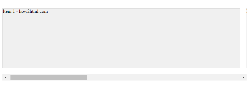
In this example, we have a .scroll-container that holds multiple .scroll-item elements. The scroll-snap-type property is set to x mandatory, which means the container will enforce a snap point for each x-axis scroll. Each item has scroll-snap-align: start; to ensure it snaps at the start of the container.

Adding Padding and Margins

Sometimes, you may want to add padding or margins to your scroll items to create space between them. Here’s how you can do that while maintaining the snap functionality.

Example 2: Horizontal Scroll Snap with Padding and Margins

<!DOCTYPE html>
<html lang="en">
<head>
<meta charset="UTF-8">
<meta name="viewport" content="width=device-width, initial-scale=1.0">
<title>Horizontal Scroll Snap with Padding - how2html.com</title>
<style>
  .scroll-container {
    display: flex;
    overflow-x: auto;
    scroll-snap-type: x mandatory;
    padding: 20px;
  }
  .scroll-item {
    flex: none;
    width: calc(100vw - 40px); /* Adjust for padding */
    height: 200px;
    background-color: #f0f0f0;
    border: 1px solid #ddd;
    scroll-snap-align: start;
    margin-right: 20px;
  }
  .scroll-item:last-child {
    margin-right: 0;
  }
</style>
</head>
<body>

<div class="scroll-container">
  <div class="scroll-item">Item 1 - how2html.com</div>
  <div class="scroll-item">Item 2 - how2html.com</div>
  <div class="scroll-item">Item 3 - how2html.com</div>
</div>

</body>
</html>

Output:

Create Horizontal Scroll Snap Using HTML and CSS

In this example, we’ve added padding to the .scroll-container and margins to the .scroll-item. We also adjusted the width of the .scroll-item to account for the padding, ensuring the items still fit within the viewport width.

Full-Width Scroll Snap with Gaps

If you want each snap point to be the full width of the viewport but still have gaps between items, you can use the gap property.

Example 3: Full-Width Scroll Snap with Gaps

<!DOCTYPE html>
<html lang="en">
<head>
<meta charset="UTF-8">
<meta name="viewport" content="width=device-width, initial-scale=1.0">
<title>Full-Width Scroll Snap with Gaps - how2html.com</title>
<style>
  .scroll-container {
    display: flex;
    overflow-x: auto;
    scroll-snap-type: x mandatory;
    gap: 20px;
  }
  .scroll-item {
    flex: none;
    width: 100vw;
    height: 200px;
    background-color: #f0f0f0;
    border: 1px solid #ddd;
    scroll-snap-align: start;
  }
</style>
</head>
<body>

<div class="scroll-container">
  <div class="scroll-item">Item 1 - how2html.com</div>
  <div class="scroll-item">Item 2 - how2html.com</div>
  <div class="scroll-item">Item 3 - how2html.com</div>
</div>

</body>
</html>

Output:

Create Horizontal Scroll Snap Using HTML and CSS

In this code, the gap property is used to create space between the items. Each .scroll-item is still the full width of the viewport, but the gap creates the visual separation.

Scroll Snap with Center Alignment

You might want your items to snap to the center of the scroll container. This can be achieved by using scroll-snap-align: center;.

Example 4: Scroll Snap with Center Alignment

<!DOCTYPE html>
<html lang="en">
<head>
<meta charset="UTF-8">
<meta name="viewport" content="width=device-width, initial-scale=1.0">
<title>Scroll Snap with Center Alignment - how2html.com</title>
<style>
  .scroll-container {
    display: flex;
    overflow-x: auto;
    scroll-snap-type: x mandatory;
  }
  .scroll-item {
    flex: none;
    width: 80vw;
    height: 200px;
    background-color: #f0f0f0;
    border: 1px solid #ddd;
    scroll-snap-align: center;
    margin-right: 20px;
  }
  .scroll-item:last-child {
    margin-right: 0;
  }
</style>
</head>
<body>

<div class="scroll-container">
  <div class="scroll-item">Item 1 - how2html.com</div>
  <div class="scroll-item">Item 2 - how2html.com</div>
  <div class="scroll-item">Item 3 - how2html.com</div>
</div>

</body>
</html>

Output:

Create Horizontal Scroll Snap Using HTML and CSS

In this example, the .scroll-item elements will snap to the center of the .scroll-container. The width of each item is set to 80% of the viewport width to allow for centering.

Scroll Snap with Multiple Items in View

Sometimes, you may want to show multiple items at once and still have the snap functionality. You can do this by adjusting the width of the items and the container.

Example 5: Scroll Snap with Multiple Items in View

<!DOCTYPE html>
<html lang="en">
<head>
<meta charset="UTF-8">
<meta name="viewport" content="width=device-width, initial-scale=1.0">
<title>Scroll Snap with Multiple Items in View - how2html.com</title>
<style>
  .scroll-container {
    display: flex;
    overflow-x: auto;
    scroll-snap-type: x mandatory;
  }
  .scroll-item {
    flex: none;
    width: 50vw; /* Adjust width to show multiple items */
    height: 200px;
    background-color: #f0f0f0;
    border: 1px solid #ddd;
    scroll-snap-align: start;
    margin-right: 20px;
  }
  .scroll-item:last-child {
    margin-right: 0;
  }
</style>
</head>
<body>

<div class="scroll-container">
  <div class="scroll-item">Item 1 - how2html.com</div>
  <div class="scroll-item">Item 2 - how2html.com</div>
  <div class="scroll-item">Item 3 - how2html.com</div>
  <div class="scroll-item">Item 4 - how2html.com</div>
</div>

</body>
</html>

Output:

Create Horizontal Scroll Snap Using HTML and CSS

In this example, the width of each .scroll-item is set to 50% of the viewport width, allowing two items to be visible at the same time. The scroll container will still snap to each item as you scroll.

Scroll Snap with End Alignment

You can also align the snap position to the end of the scroll container using scroll-snap-align: end;.

Example 6: Scroll Snap with End Alignment

<!DOCTYPE html>
<html lang="en">
<head>
<meta charset="UTF-8">
<meta name="viewport" content="width=device-width, initial-scale=1.0">
<title>Scroll Snap with End Alignment - how2html.com</title>
<style>
  .scroll-container {
    display: flex;
    overflow-x: auto;
    scroll-snap-type: x mandatory;
  }
  .scroll-item {
    flex: none;
    width: 80vw;
    height: 200px;
    background-color: #f0f0f0;
    border: 1px solid #ddd;
    scroll-snap-align: end;
    margin-right: 20px;
  }
  .scroll-item:last-child {
    margin-right: 0;
  }
</style>
</head>
<body>

<div class="scroll-container">
  <div class="scroll-item">Item 1 - how2html.com</div>
  <div class="scroll-item">Item 2 - how2html.com</div>
  <div class="scroll-item">Item 3 - how2html.com</div>
</div>

</body>
</html>

Output:

Create Horizontal Scroll Snap Using HTML and CSS

In this example, the .scroll-item elements will snap to the end of the .scroll-container. This means that as you scroll, the right edge of the items will align with the right edge of the container.

Scroll Snap with Custom Scrollbar

Customizing the scrollbar can improve the visual appeal of your scroll container. Here’s how you can style the scrollbar for webkit-based browsers.

Example 7: Scroll Snap with Custom Scrollbar

<!DOCTYPE html>
<html lang="en">
<head>
<meta charset="UTF-8">
<meta name="viewport" content="width=device-width, initial-scale=1.0">
<title>Scroll Snap with Custom Scrollbar - how2html.com</title>
<style>
  .scroll-container {
    display: flex;
    overflow-x: auto;
    scroll-snap-type: x mandatory;
    scrollbar-width: thin;
    scrollbar-color: #888 #f0f0f0;
  }
  .scroll-container::-webkit-scrollbar {
    height: 8px;
  }
  .scroll-container::-webkit-scrollbar-track {
    background: #f0f0f0;
  }
  .scroll-container::-webkit-scrollbar-thumb {
    background-color: #888;
    border-radius: 4px;
  }
  .scroll-item {
    flex: none;
    width: 100vw;
    height: 200px;
    background-color: #f0f0f0;
    border: 1px solid #ddd;
    scroll-snap-align: start;
  }
</style>
</head>
<body>

<div class="scroll-container">
  <div class="scroll-item">Item 1 - how2html.com</div>
  <div class="scroll-item">Item 2 - how2html.com</div>
  <div class="scroll-item">Item 3 - how2html.com</div>
</div>

</body>
</html>

Output:

Create Horizontal Scroll Snap Using HTML and CSS

In this example, we’ve styled the scrollbar using both the standard properties for Firefox (scrollbar-width and scrollbar-color) and the -webkit- prefixed pseudo-elements for webkit-based browsers like Chrome and Safari.

Scroll Snap with Overflowing Content

Sometimes, your content might be wider than the viewport or container. Here’s how you can handle overflowing content with scroll snap.

Example 8: Scroll Snap with Overflowing Content

<!DOCTYPE html>
<html lang="en">
<head>
<meta charset="UTF-8">
<meta name="viewport" content="width=device-width, initial-scale=1.0">
<title>Scroll Snap with Overflowing Content - how2html.com</title>
<style>
  .scroll-container {
    display: flex;
    overflow-x: auto;
    scroll-snap-type: x mandatory;
  }
  .scroll-item {
    flex: none;
    min-width: 120vw; /* Content is wider than the viewport */
    height: 200px;
    background-color: #f0f0f0;
    border: 1px solid #ddd;
    scroll-snap-align: start;
    margin-right: 20px;
  }
  .scroll-item:last-child {
    margin-right: 0;
  }
</style>
</head>
<body>

<div class="scroll-container">
  <div class="scroll-item">Item 1 with wide content - how2html.com</div>
  <div class="scroll-item">Item 2 with wide content - how2html.com</div>
  <div class="scroll-item">Item 3 with wide content - how2html.com</div>
</div>

</body>
</html>

Output:

Create Horizontal Scroll Snap Using HTML and CSS

In this example, the .scroll-item elements have a minimum width of 120% of the viewport width, which means they will overflow the viewport. The scroll container will still snap to the start of each item.

Scroll Snap with Dynamic Content

When dealing with dynamic content, you might not know the exact width of each item. Here’s how you can set up scroll snap in such scenarios.

Example 9: Scroll Snap with Dynamic Content

<!DOCTYPE html>
<html lang="en">
<head>
<meta charset="UTF-8">
<meta name="viewport" content="width=device-width, initial-scale=1.0">
<title>Scroll Snap with Dynamic Content - how2html.com</title>
<style>
  .scroll-container {
    display: flex;
    overflow-x: auto;
    scroll-snap-type: x mandatory;
  }
  .scroll-item {
    flex: 0 0 auto; /* Allow items to shrink or grow as needed */
    min-width: 50vw; /* Minimum width */
    height: 200px;
    background-color: #f0f0f0;
    border: 1px solid #ddd;
    scroll-snap-align: start;
    margin-right: 20px;
  }
  .scroll-item:last-child {
    margin-right: 0;
  }
</style>
</head>
<body>

<div class="scroll-container">
  <div class="scroll-item">Dynamic Item 1 - how2html.com</div>
  <div class="scroll-item">Dynamic Item 2 - how2html.com</div>
  <div class="scroll-item">Dynamic Item 3 - how2html.com</div>
</div>

</body>
</html>

Output:

Create Horizontal Scroll Snap Using HTML and CSS

In this example, the .scroll-item elements have a flexible basis (flex: 0 0 auto;) and a minimum width set. This allows them to adjust their size based on the content, while still maintaining the snap functionality.

Scroll Snap with Responsive Design

It’s important to ensure that your scroll snap layout is responsive and works well on different screen sizes. Here’s anexample of how to make your scroll snap setup responsive.

Example 10: Scroll Snap with Responsive Design

<!DOCTYPE html>
<html lang="en">
<head>
<meta charset="UTF-8">
<meta name="viewport" content="width=device-width, initial-scale=1.0">
<title>Scroll Snap with Responsive Design - how2html.com</title>
<style>
  .scroll-container {
    display: flex;
    overflow-x: auto;
    scroll-snap-type: x mandatory;
  }
  .scroll-item {
    flex: none;
    width: 80vw;
    height: 200px;
    background-color: #f0f0f0;
    border: 1px solid #ddd;
    scroll-snap-align: start;
    margin-right: 20px;
  }
  .scroll-item:last-child {
    margin-right: 0;
  }
  @media (max-width: 600px) {
    .scroll-item {
      width: 100vw; /* Full width on smaller screens */
    }
  }
</style>
</head>
<body>

<div class="scroll-container">
  <div class="scroll-item">Responsive Item 1 - how2html.com</div>
  <div class="scroll-item">Responsive Item 2 - how2html.com</div>
  <div class="scroll-item">Responsive Item 3 - how2html.com</div>
</div>

</body>
</html>

Output:

Create Horizontal Scroll Snap Using HTML and CSS

In this example, the .scroll-item elements are set to take up 80% of the viewport width by default. However, a media query adjusts this to 100% on screens that are 600px wide or smaller, ensuring that each item takes up the full width of the screen on smaller devices.

Conclusion

Scroll snap provides a powerful way to create engaging and user-friendly scrolling experiences on the web. By using the examples provided, you can implement various scroll snap features in your projects, from basic setups to more complex responsive designs. Remember to test your implementation across different browsers and devices to ensure a consistent and smooth user experience.

Like(0)

HTML Articles